Every brand starts somewhere. For DeafMonitor, that starting point was an AI-generated logo from one of those quick logo-maker platforms.
It checked the boxes early on — it gave us something to work with, something to put on the site while we focused on building the platform itself. But as DeafMonitor grew, the logo started to feel like exactly what it was: a placeholder.
A Fresh Set of Eyes
I sent the logo over to my good friend Austin Balaich, Creative Director at Sorenson, to see what he thought. It didn’t take long for him to identify what was off. Austin has a sharp eye for branding, and he immediately recognized the telltale signs of an AI-generated mark — the kind of subtle inconsistencies that most people can’t pinpoint but everyone can feel.
More importantly, he saw the potential. Rather than scrapping everything and starting from scratch, Austin approached the icon through a geometry lens. He broke down the shapes, analyzed the proportions, and refined each element into something more precise and intentional. Every curve, every angle, every line was tightened up with purpose.
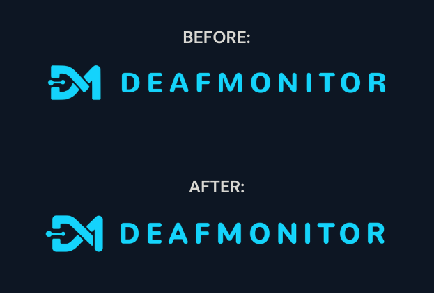
Unifying the Brand
One of the biggest shifts Austin made was aligning the icon with the brand typeface. Before, the logo mark and the wordmark felt like two separate pieces sitting next to each other. They coexisted, but they didn’t connect. Austin brought them into alignment so that the icon and the typography share the same visual DNA — the same weight, the same rhythm, the same personality. When you look at the logo now, it reads as one cohesive unit, not a mark and a name placed side by side.
That kind of unification is what separates a logo from a brand identity. It’s the difference between something that looks fine and something that feels right.
Rolling It Out
The refined logo is now live across every area of the DeafMonitor site. From the header to the footer, from favicons to social assets — the new mark is reflected in every touchpoint. Consistency matters, and we wanted to make sure the refreshed identity showed up everywhere it needed to.
Austin also created an end slate animation for DeafMonitor — a polished motion piece that brings the new brand to life. You can see it in action on the site now.
Why This Matters
It’s easy to overlook branding when you’re deep in the weeds of building a product. There’s always another feature to ship, another bug to fix, another page to optimize. But branding is the first thing people experience before they ever interact with your platform. It sets the tone. It builds trust. It tells people whether or not you take what you’re doing seriously.
Having someone like Austin in my corner — someone who genuinely cares about the craft and understands the weight that visual identity carries — made all the difference. This wasn’t just a logo update. It was DeafMonitor growing into its own.
See It for Yourself
The new brand is live. Come check it out and join the community — create your free DeafMonitor account today.
— Bryan